


Data Has Never Been Objective
Rethinking data and how to make it work for your business

Here is a headline you may have seen recently…
Return-to-office mandates just got another vote in their favor: A new study says WFH results in 18% less productivity.
(Business Insider)
The WFH vs. RTO debate is a hot one, and headlines like these are popping up all over the media. This one seems to be pretty certain
But is it true? Are you, me, and millions of people 18% less productive when working from home… or was this number cherry picked by someone with an interest in commercial real estate?
Spoiler alert. It’s the latter. We will look at the details here in a bit, but first I want to point out the headline.
It is clickbait-y, but it is not clickbait. Quite the opposite. Its purpose is to get this one “objective” data point out into there and into the heads of CEOs, HR managers, and the business world overall. Its purpose is to influence people with a veneer of objectivity, even though it is total bologna.
However, it is a great example of how data is use and misused and why we need to rethink data and if it is even useful…

Data has never been objective
This quote broke my brain:
Numbers are always accessory to some purpose. If you want to make sense of a statistic, track down what purpose it aided and abetted.
Deborah Stone, Counting: How We Use Numbers To Decide What Matters
Her argument comes from a practical standpoint. Not what data is, but how data is used. Manipulated. Aiding and abetting our purposes.
Ever since we added an e- to commerce and digital- to marketing, we have been obsessed with data and analytics. Every thing we do revolves around measuring the results with our precious data, so we can be data-driven and hone in on the perfect marketing campaigns.
Strangely enough, businesses, with access to troves of data, are still guessing as to what they should do next. More data won’t help.
Going back to that quote, Stone pulls back the curtain on data and shows us that data is used, not analyzed, and before someone even starts to look at data, they have a purpose. 99% of the time (see what I did there...) they are hoping data supports their claim.
We all do it. Me. You. Colleagues. Vendors. Agencies. Newsrooms. It’s in our nature.
Here are some examples:
Omission
A while back, a pretty sizable error when launching a promotion on our website. We caught it before too long, but still we informed the team on what happened and how much this mistake potentially lost.
There were two numbers that gave a rough estimate of customers that might have been affected.

Checkouts Initiated, as you know, will have a lower number than Add To Cart. Much lower in this case.
Guess which one was left out of the report?
Shopify Apps
A colleague decided to run a quiz using an app. This was ahead of a minor holiday and it seemed like a great idea. But lackluster results in the end. Quizzes don’t work for all websites.

But this app was able to claim that is helped us make $1500 in sales. Which wasn’t true. 2-mins of digging showed that it was only $600.
The data model the app uses for attribution is over-simplified, making itself look more effective than it is.
SMS apps are even worse about claiming attribution for sales that you would have gotten anyway.
I ran a test using one of the more popular (and very expensive) SMS apps. If you only looked at the data it collected normally, the app generated enough revenue to justify the cost.
But through the test, we saw that the conversions that actually came from SMS was just a fraction of what it showed.

In the end, having the real numbers, not the numbers the app gave us, saved 300 bucks per month in subscription fees to an app that wasn’t pulling its weight.
Side note: the image above is what the app’s team set up for us, and first thing we did was change the douche-y No, I’ll Pay Full Price text. Never ever use any version of that on your website.
Research Firms
Do you know Kai Ryssdal? The host of the Marketplace podcast?
He is a thoughtful person, and if you get a chance, listen to him being interviewed as a guest on other’s podcast. Good stuff.
Anyway, on Marketplace he was interviewing the president of one of the top market research firms in the world. They are global. Employees all over the world.
They were talking about employee satisfaction. And that firm did a global study to see how satisfied we are in the workplace. They found that only 60% of employees were satisfied in their current job.
That’s kinda depressing when you think about it…
Anyway, Kai pushed him a little bit… and asked the president about his own organization. Did he know the rate of employee satisfaction among his own people?
And yes, he did!
The president of a firm that designs, conducts, and analyzes surveys said that they ran their own internal survey. Lo and behold, they were above 90% in employee satisfaction.
Obviously, they set up the survey in such a way to make their numbers higher. Which is quite telling when an industry leader whose reputation is based on accuracy and objectivity can blatantly share data we can all see through.
That guy is not one of the real heroes…

Media
And finally, about that headline we started with…
Return-to-office mandates just got another vote in their favor: A new study says WFH results in 18% less productivity.
This one is disturbing because it has real work effects. It gives corporate leaders another arrow in their quiver to enact RTO rules. Which is not good for hundreds of thousand of employees who have structured their lives around WFH.
It really doesn’t matter which side of the debate you are on. Personally, I’m on Team Hybrid, but this headline is using data to back its claim.
If you read the article, you’ll find that it cites data from the highest source of objectivity… A study from economists at MIT and UCLA.
You can not beat that clout. Professors. Economists. It is their job to publish studies that stand up to heavy scrutiny on its reliability and objectivity. To most people, objectivity is a given with academic studies.
But for this dumb study, objectivity is their flaw.
They studied performance of entry-level, data-entry worker in India… apparently this cohort was chosen to reduce factors that might affect their precious study.
Do you think your work and data-entry workers in India is an apples to apples comparison?
Doubt it.
Atkin said that the study's estimates around productivity may "underestimate effects in other industries" especially those in which defining, isolating, and measuring productivity may be more challenging. “We don't have reasons to believe that there will not be productivity effects in these settings even if they are harder to measure,” he wrote.
Well, there you go… the author of the study basically says its all apples, despite no data to back up the notion that these results could be extrapolated to other industries. It’s just his opinion.

Numbers don’t lie… but they don’t have to when they have us!
The Purpose of Data
I don’t want to diminish the importance of data. Though people might use it to their own benefit or with ulterior motives, that does not negate how much it helps us in ecommerce and marketing.
My goal here is to reevaluate how we view data. To look at it as a tool rather than a fact. Because if data is accessory to a purpose, and the purpose of your business is to make money, then we should use it for that purpose and not for after-the-fact justification or time-filler in a meeting.
So what we need as ecommerce operators is to have a single source of truth that can dependable assist us in reaching our goals. Not an amalgamation of data from various source with various purposes.
That starts with Data Modeling. Which is awesome. Because when you get your data right, you get to do the fun, creative parts that fuels marketing… the stuff that goes beyond the numbers.
So let’s get down and nerdy for a minute.
Data Modeling
Data modeling might be a highfalutin name, but we’re gonna use it because it insists that our data is structured for a purpose.
What is it?
A data model is an abstract view on top of a physical database table that you may manipulate without directly affecting the underlying data.
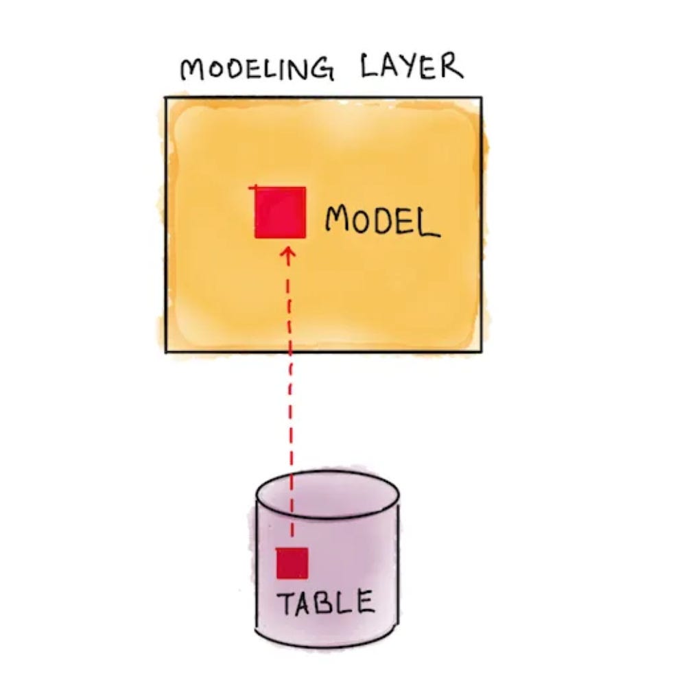
(holistics.io)
This image is the most concise way I’ve seen it put. Essentially, the modeling layer is how data is presented to you.
Think of Facebook Ads Manager. When you are looking at your campaigns, there are dozens of columns that you can scroll through. That is the data model. It draws from the “table” of data that Facebook collects.
Same with Google. All of your website data is stored in massive data warehouses, and when you open up GA4, you are looking at the data model. A very complex one.
All apps have some sort of dashboard to view the data.
That is the long and short of it…
The Problem
The problem with these analytics tools and dashboards is that they are too much, and too complicated. They give you ALL the available data. It makes them look robust and gives users a sense of control over their marketing performance.
But does it really?
I don’t think so. Not because it can’t, but because we are human and care about what we want to care about and ignore everything else. We are biased. And having all the data helps us stay that way.
The Solution
Instead of having it all, it is better to break it down into what we need, purposefully. Instead of an overly complicated everything board, have smaller data models based on specific goals.

Simplicity helps on 2 fronts:
It makes data digestible
It makes data actionable
For example, if you design advertising assets for Instagram, would you be more interested in engagement on the ad, or more interested in conversions on the website?
Those metrics are not 100% unrelated, but for your purpose of creating more engaging ads… you would appreciate a model focused on your outcomes.
Creating models for specific purposes defines which metrics you include. Here are a few examples of focused data models:
Comparison of ROAS between ad creatives
Real-time MER (marketing efficiency ratio)
Side-by-Side ROI by Marketing Channel
Month Goal Gauges for Teams
Not too long ago, I set up a dashboard to give our team a snapshot of traffic sources. For the most part, we knew where most traffic came from, but Pinterest was hanging out on the bottom of the top 5.
It wasn’t a ton of traffic. Maybe a few thousand per month. So not much, but it was coming from the Pinterest account that I didn’t even know our company had… and hadn’t been touched since 2019.
Now there is an opportunity to explore.
Having various data models give you focused snapshots, not a glut of data to sift through. It reveals cracks, roadblocks, as well as opportunities. It puts colleagues on the on the same page. Data is no longer siloed in a spreadsheet, glanced at once a week.
Because models insist that data is structured for your purpose.
Knowing is half the battle
For most of my marketing career, I have not cared about data. I leaned into qualitative research and anecdote to fuel creative problem solving. It’s more fun.
Over time I learned that our web data, with practical data models, is what makes our creative endeavors permissible. It gives legs to things that work, and puts the kibosh on things that don’t work.
Data modeling gives parameter to creative freedom. It includes accountability. It makes us pause to consider outcomes rationally. It reduces impulsive reactions.
This is where we need to start in marketing and ecommerce. But it is only the start. When we know where we want to go and how we will measure our steps, we are ready for what comes next… that which goes beyond the data… the schmata.
Next time, I will write more on the schmata and how it helps us build great marketing. But that is enough for today!
I’m always happy to nerd out on this stuff, so if you’d like, connect with me on LinkedIn or reply to this email. And if you know someone you think would be interested in this topic, send it their way!