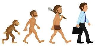
Homo Customericus and a Lack of Logic
In the last article I mentioned Homo Economicus. I didn’t make that up. This idea comes form a school of thought that needs to be addressed. Because it is pervasive. And it is wrong.
John Stuart Mill was an influential philosopher in the 1800s. He wanted to make sense of the world and people, and so took it upon himself to think things through as logically as possible. Too logical it turns out…
Mill came up with this idea of Homo Economicus, or the Economic Man. The idea is that people are logical. They have an infinite ability to make rational decisions to improve themselves. So when given a choice of A over B, they will choose the one that maximizes utility and minimizes the cost.
One example I saw when reading up on this was a bag. There is one for $5 and one for $7. If the one for $5 can do the trick, then that is the logical decision. Easy. Maximized utility and minimized cost. We are masters of our universe.
Except this is stupid.
That is not how people work.
Logic be damned…
Think about shopping on Amazon. When you are buying a non-branded item, do you just buy the cheapest one? Or do you buy one that is somewhat more than the very low end because you guess that it must be better?
I, for one, always choose one in the middle range. Is that logical? Not really. But I know the cheapest one will be the cheapest quality. So I have a workaround so I don’t feel like I am wasting my money.
Then again, if I were completely logical, I wouldn’t be shopping on Amazon for low quality products.
This process is anything but logical. And I am not the only one that does mental gymnastics when shopping. You have your own probably.
The only thing you can count on is that people don’t shop logically.
Homo Customericus…
So Mill’s idea of Homo Economicus is bunk, and we need to think about our customers in a different way. As (ab)normal people.
Back to the bag example. If the one for $5 can do the trick, then how tf does this exist?
Customers make decision on a variety of factors including perceived value and emotion. These factors influence customer psychology more than we realize.
Like when I bought haircutting scissors on Amazon, I chose a pair that cost $30 instead of one that was $15 because I perceived the value to be much higher, and also because I knew that I would feel stupid if I got the cheap ones and they sucked.
Whoever decides to buy a Gucci bag is not even buying a bag. There isn’t much to that piece of stitched canvas other than an its obnoxious pattern, but they are buying jealous looks from other women…
And I guess that feeling is worth more than $2300?
Oh… and the $30 pair of scissors sucked… logic.
Customers see themselves in you…
Or at least they are trying to.
Your customers, sitting there on their phone looking at your website, are mentally “trying on” your product. It doesn’t matter if it is how a dress will look like on them, or how much better they will feel with that supplement, or how much faster they can get work done with an extra computer monitor.
They are imagining you in their life.
If they see themselves using your product, and they like it. Good. They might buy.
If they don’t like what they see. Who cares. They are not the right customer.
If they cannot see themselves at all using your product. That is the worst.
They might be the right customer, but you haven’t done a good job of presenting your product. They will leave. No imagination, no sale.
And no feedback as to why…
And whatever you paid to get them on your website… poof.
Product Page logic…
Product pages are interesting to me because everyone knows they are super important but then don’t spend much time or effort on them.
Even ecommerce website builders are laid out in a way that pushes the product to be somewhat of an afterthought compared to the rest of the website.
But regardless, this is where your customers click the magic button.
In my conversation with Rishi Rawat on the podcast, he points out on average 68% of website visitors are totally new. Which means that on average 32% are returning.
So think about those in the 32%. They are not passersby. They are considering if they want to buy from you.
Say half of those are just checking on a previous order, and half are potential customers. That is still 16%, which is a lot.
The average conversion rate for an ecommerce store hovers around 3%, then what do the other 13% need in order to be confident in making a purchase?
Do they perceive your product as the best?
Are they clear on the benefits, and how the product features will deliver those benefits?
Are you conveying the emotion they want to feel?
We have remember that that 13% is there hoping to find something they want or need. They are waiting for you convince them.
But they won’t wait long…
Product pages that are awesome…
Here are a couple of product pages that have won me over. Just like the bag example, I didn’t choose a $5 wallet… perceived value and emotion beat out logic once again…
Bellroy Wallet
Chaco Sandals
No time like the present…
We are not purely logical as John Stuart Mill thought. That goes for most decisions we make, which is why it is so important to understand customer psychology as ecommerce professionals.
And when we do understand the customers and how they think… we need to translate that into product pages. Not an easy task, but hey, maybe 13% of your visitors are waiting on it.


