


The Psychology of Colors

Why do competing social media networks all use blue?

And why does GE, Samsung, Intel, P&G, Pfizer, Oral-B, Chase Bank, Goldman Sachs, and Visa also use blue in their branding?
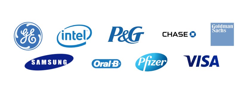
Even Google’s famously colorful logo uses blue twice. BIG G and lil g…

This is not by accident. Our brains pick up on signals and cues when we assess something new. Color is one of those signals. We don’t consciously think about it, but colors can and do play a role if how we perceive a brand or company.
So when it comes to design and branding, it is important to know what’s going on behind these colors.
However, I like to point out that even though science backs up some ideas in color theory, there are plenty of exceptions. There are no hard and fast rules to how it plays out across age, culture, and industry.
Feel free to bend the rules to your will.
So…
Let’s look at each of these colors and how they affect out perception
Then I will show you how and why I change my website’s colors
And then a look at one of the best color scheme changes by one of America’s most well known brands
Now… back to the blue-washing of these tech, health, and financial firm logos… what’s it about?

As I sit here and write this, I look down and see that my shirt is blue. My sweater is blue. My blue jeans are blue. And my shoes are grey though. One might assume that I like blue a lot.
Blue is associated with tranquility, calm, and serenity. However, the Zuck, Dorsey, Goldman, or his Sachs didn’t choose blue because they are chill. They chose it because it is blue is also perceived as dependable and trustworthy.
Blue is the color of the sky and the seas… two things nature that you can trust to show up day in and day out, tide in and tide out. There is an innate trust in blue.
It makes sense for these companies to brand with blue.
We want to trust health-related goods. We want to trust financiers. And 100%, we want to trust that social media platforms are not doing anything fishy with our personal data…
Hence the blue.
When to use blue:
Use blue to be seen as serious and trustworthy as a subject matter expert, or as a dependable service.
Industries: service providers, tech, agencies, and physical products that people depend on for everyday use (like cars).
When not to use blue:
Goethe (guy who wrote Faust) proposed that blue symbolized Gemein (common, the mean), basically saying that blue is the opposite of excitement.
If you want to energize your audience, get them excited, or be seen as action-oriented, use a different color. Or mix it with…

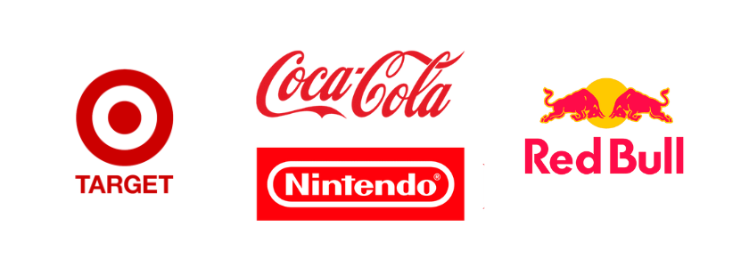
Do people see red when they get angry? Do bulls charge when they see red? Does the color red enrage us or make those bulls want to gore their poor victims?
As far as the bulls are concerned, red has nothing to do with them charging. They are colorblind to red. It is the that movement attracts their attention… the brosef going “come at me bruh” is what enrages them…
Can we blame ‘em?

Red is the color of passion, love, and violence. Visible when nature gives life and absent when it takes it away. Seeing it elicits a heighten sense of excitement and urgency.
It’s not in an of itself a call-to-action, but it is a call-to-attention.
Perhaps the reason the Spanish matadors taunt the bulls with a red muleta is not because it enrages the bull, but because it excites the audience…
Scientist tested the effect of red & blue light on people with hypertension. They found that red raises our blood pressure, and blue decreases our blood pressure.
So red physically excites us, but not necessarily towards a positive or negative emotion. It can go either way.
Brands use this all the time to signal that you should do something. Whether it is to Share a Coke, or do this…

When to use Red:
If you want to draw attention to an action that you want your customers to take, red can be good. It is bold and makes a point of urgency.
Industries: Sports, automotive, tools, CPG (shelf attention), interactive products (like Netflix or Youtube).
When to not use Red:
Being bold is not good for all industries. Banking, advisors, and others who mitigate risk might not want to use red.

Look at the stars. How they shine for your… And they were all yellow.
Yellow is positive. It is sunshine and clarity. It represents happiness and contentment. It is energetic. That is why I chose the accent color of this newsletter to be yellow.
But yellow has a dark side…
Did you feel irritation and aggression when you to read those Coldplay lyrics just now?
Probably… the color yellow is known to elicit irritation and aggression in some. It is the most fatiguing color due to the amount of light reflects. So it can be bothersome.

For the most part, those cases are when the color scheme of a room or location is overloaded with yellow. This effect doesn’t really spill over into branding or logos…
When to use Yellow:
Use it to convey speed, convenience, and fun. It is attention-grabbing, but it is best to pair it with a strong contrasting color to really make it stand out.
Industries: Car wash, fast food, construction, and physical products that are designed to make something easier or quicker.
When not to use Yellow:
Text. It is hard to read. It is the most fatiguing color and known to irritate people. A triple threat.
Yellow can be associated with cheap. So not good if you sell luxury or high-end goods.

Green thumbs, green tech, going green... Green is universally associated with nature and fresh. Health and vitality and fertility. It’s color au naturale.
Which makes sense why Tropicana and BP (British Petroleum) use green. One evokes freshness straight from the orange grove… the other doesn’t evoke anything related to oil…
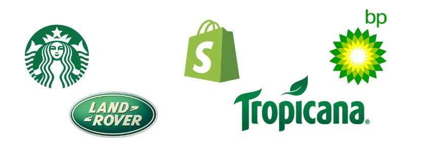
But nature is not all that’s going on with green. Shopify, our friendly ecommerce juggernaut, uses green too. Because green is also associated with money, wealth, and prosperity.
Shopify wants its merchants to associate owning an ecommerce store with financial success and prosperity. Nice choice Toby.
When to use Green:
Use it for eco-friendly, sustainability, or future-oriented business.
Industries: All natural good, finance, health.
When not to use Green:
Green is restful… the balance between the energy of yellow and the calmness of blue. It doesn’t move people to action. It’s directly opposite of red.
If you want to seem action oriented, don’t use green. Or if you are an oil company.

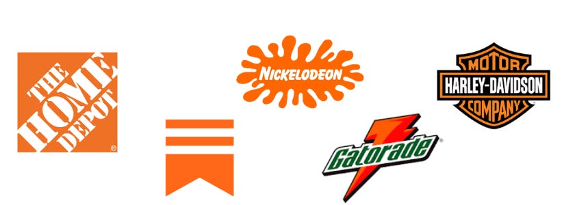
Now here is a fun color… Orange is popular in marketing and on websites. It has the energy and excitement of red with the happiness of yellow. It’s playful and reminds us of our childhood
Orange sparks creativity and freedom. Not the freedom of William Wallace…

but the freedom to explore our ideas and let our creative selves run around… Probably why Substack uses orange for its logo.
When to use Orange:
Use it to give a little pep, and little liveliness to your brand.
Industries: Fitness, sports are perfect, outdoor gear and services, creative industries, and children’s goods.
When not to use it:
Exploring means there is an unknown, and an unknown = risk.
Finance should steer clear… as well as funeral homes.

Black is the power color. It is in contrast to light. It is finality. It is exclusive, sophisticate and, mysterious.
The little black dress is popular for a reason. It is elegant and gives you an air of confidence.
And according to color theory, it literally makes you feel elegant and gives you confidence.

When to use Black:
Use it to show sophistication and status. Class.
Industries: Luxury, sports.
When not to use Black:
Not great for children’s and toy, or for cheap products. And definitely not if your products need to stand out, like CPG, on the shelf.

Purple is the color of nobility, wisdom, and mystery… and Taco Bell. It’s a weird one.
We know from earlier, red and blue have opposing psychological and physiological effects. Purple sits right between them. It’s not a primary color or as common, which is why royalty adopted it as their color.
Purple has also been adopted by Gen Z.
We played Nintendo as kids, and became adults who work in the big blue corporate world. Gen Z doesn’t seem to like labels or strict dichotomy so much. They don’t agree that every thing is black or white, red or blue.
Maybe that is why Taco Bell rebranded to purple? Because purple doesn’t evoke taco-ness. It is definitely why Twitch is purple though. That I am sure of.
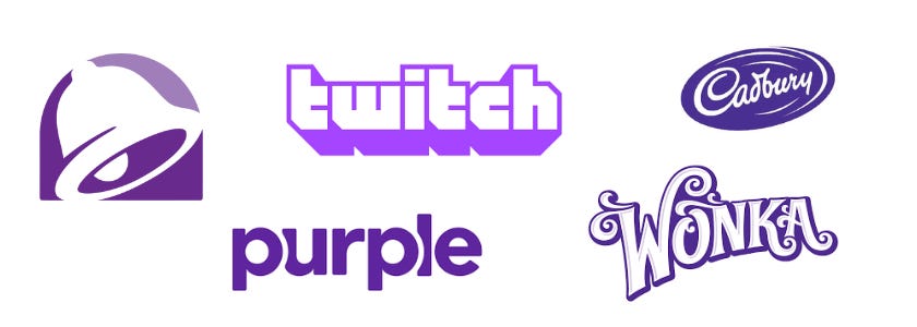
When to use Purple:
Apparently if you make chocolate… Wonka, Cadbury, Dove, Ghirardelli…
Its popularity skews younger, but can work with any brand for any age where you want to keep things neutral, inclusive, and not boring.
When not to use Purple:
Cover art for a death metal albums or goth clothing… or funeral homes for that matter.

One last color to cover. Brown.
It is more green than green when it comes to psychology. It is as earthy as you can get. Because earth, aka soil, is brown and organic. It is the color of wood, which is classic, homely, and warm.
It is not excited, or moving, but sturdy.
When to use Brown:
Funeral homes!!! …finally got it.
When not to use Brown:
Toilet paper brands.
Walking through a color scheme…
I have a new appreciation for designers’ use psychology of colors and how it shapes the way we perceive a brand, product, or service.
For the longest time, my website was mostly blue and white. With black text. Kind of boring when I think about. But as I already mentioned, I like blue.
However, what I like isn’t what is important. What is important is what others feel when they visit my website.
Was I trying to get people to feel confident? See me as dependable? As trustworthy?
That sounds good I guess… but was that the point I was going for, or was it just my personal color preference?
After some thought, I realized that I chose blue because it is neutral and safe. Easy on the eyes and obviously popular with the biggest business on the planet.
It was too safe.
I have been writing content about progress and the importance of being active in our marketing. I was looking ahead at a looming rough patch ahead in ecommerce and calling for change in how we think about the customer.
My blueness was dull. It didn’t reflect my content or ideas.
So I updated my website. I wanted to reflect that. To call to attention where I feel brands should pay closer attention.
Not everyone will like it, but not everyone is supposed to.
Businesses rebrand all the time. You will notice that most of it is updating the look and feel of their logo or website. It shows they are active and with it.
But you will also notice that when they also change the color scheme, there are deep and wide changes across the entire organization and messaging.
A recent case of this you might remember from last year:

Baskin Robbins decided to ditch the modern in 2022. The new logo is actually a throwback to the colors used in their original advertising campaign from 1953… the same year they launched their famous 31 flavors.
This shift in their marketing strategy is to re-introduce Baskin Robbins with that sense of nostalgia around eating ice cream.
Kids want ice cream, but it is the millennial and Gen X parents who decide where to get it… those nostalgic colors are therefore quite important to the brand. Those colors speak louder than the goofy font.
There are no hard or fast rule when it comes to choosing a color for your logo, branding, or packaging.
Just remember that it is never about you or what you like. It is about how you want the customer to perceive you.
Would love to hear your thoughts in the comments!
Shoutout
If there is one thing makes us love a brand, it is storytelling. Recently I found this great newsletter called Stories for Selling. Every week there is a new case study on a marketing campaign where brands tell stories effectively. Great takeaways that will give you ideas for your own business. Check out this one about Ryan Reynolds and his ChatGPT written commercial for Mint, and be sure to subscribe!